|
#11
 13th October 2011, 11:09 AM
| ||||
| ||||
|
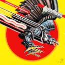
I really like panel C - it's obscure, sinister, and pretty simplistic. Much better than panel B which a looks a bit strange to me.  However, Melton's new artwork remains my favourite so far! Greetings!  |
|
#12
13th October 2011, 11:27 AM
| ||||
| ||||
|
Glad they went with the original theatrical poster for panel C. Synapse ruined it on their dvd cover by giving Cordell a goofy looking face and changing the way he held his nightstick. Well done Arrow.  Cap. Vic RobotPants M.D. likes this.
__________________ "Give me grain or give me death!" |
|
#13
13th October 2011, 03:05 PM
| ||||
| ||||
|
I like the artwork for Panel B, the style reminds me of a side scrolling/beat 'em arcade game Boss or something.
__________________ BEYOND HORROR DESIGN Last edited by Beyond72; 13th October 2011 at 03:33 PM. |
|
#14
13th October 2011, 06:19 PM
| ||||
| ||||
| Quote:
|
|
#15
13th October 2011, 06:36 PM
| ||||
| ||||
|
I actually like the Synapse BD cover. It's not fantastic, but better than their dvd. None are as good as the original art though.
__________________ "Give me grain or give me death!" |
|
#16
14th October 2011, 11:36 AM
| ||||
| ||||
|
And so here's the forth and final artwork panel revealed here...  I'll stick up a poll in just a sec.
__________________  |
|
#17
14th October 2011, 11:55 AM
| ||||
| ||||
|
It is a really tough choice between the new artwork and Panel C -- both are excellent.
__________________  |
|
#18
14th October 2011, 11:57 AM
| ||||
| ||||
|
D is too much like C. Although, no matter, I always intended to use C if it was one of the choices. It's all good in the hood.
__________________ "Give me grain or give me death!" |
|
#19
14th October 2011, 12:25 PM
| ||||
| ||||
|
It'll be C for me with A paying a visit from time to time! Cannot wait for this release!
__________________ Darth Elvis & The Imperials www.darthelvis.co.uk http://twitter.com/darth_elvis Hang Loose & Join the Community @ www.theforcebook.com |
|
#20
14th October 2011, 12:33 PM
| ||||
| ||||
|
I think I'll stick with panel A, all the others are pretty poor IMO.
|
 |
| Like this? Share it using the links below! |
| |


 17Likes


 Linear Mode


