|
#1
 1st April 2011, 08:42 PM
| ||||
| ||||
|
The artwork has already been announced, so feel free to lavish praise on it (or say what you don't like about them). Use this as the forum to talk about the artwork, contribute your own and say which one you will be displaying. 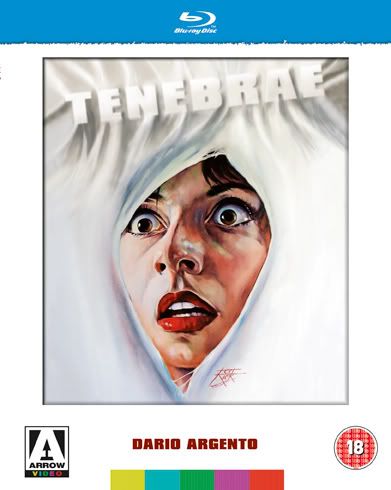
__________________  Last edited by Nosferatu@Cult Labs; 1st April 2011 at 09:48 PM.  |
|
#2
1st April 2011, 08:54 PM
| ||||
| ||||
|
Yeah,I really like that one. I'm a sucker for the old usual artwork though.... ")
__________________  Teddy, I'm a Scotch drinker - you know that. I just have the occasional brandy when I'm not drinking. |
|
#3
1st April 2011, 09:45 PM
| ||||
| ||||
|
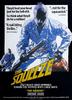
I clean forgot the artwork had already been announced, but here it is in order. Panel #2 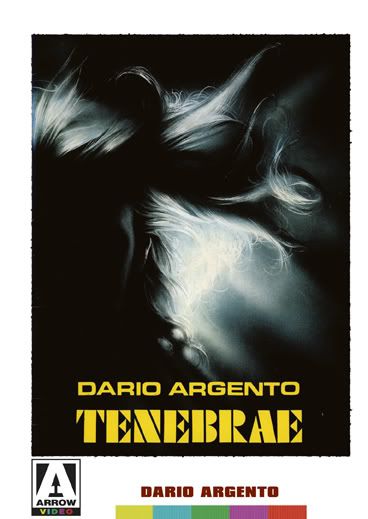 Panel #3 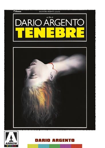 Panel #4 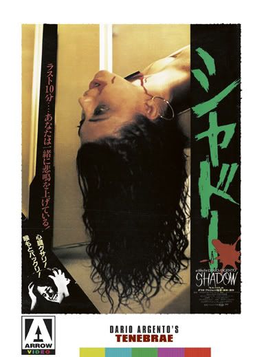
__________________ |
|
#4
1st April 2011, 09:47 PM
| ||||
| ||||
|
Nice to see some more Japanese artwork on an Arrow release.  |
|
#5
1st April 2011, 10:42 PM
| ||||
| ||||
|
Have to admit I'm slightly underwhelmed by these sleeves. I love Rick's cover, not too bothered about panel 3 as I already have that on my AB dvd*, and to be honest am unsure what panel 2's all about  I do quite like the Japanese cover though. I do quite like the Japanese cover though.*not that it's a bad cover, just a bit sick of seeing it |
|
#6
1st April 2011, 10:51 PM
| ||||
| ||||
|
The problem with Tenebrae (along with some of Argento's other later gialli) is that it seems to have not been marketed too well, unfortunately. This means that there is a shortage of great poster art available. |
|
#7
1st April 2011, 11:05 PM
| ||||
| ||||
|
Yeah, definitely. There really don't seem to be too many posters out there that Arrow could have used.
|
|
#8
1st April 2011, 11:56 PM
| ||||
| ||||
| That's disgusting! You should put a bow on there or something.  Colin654 likes this.
__________________ BEYOND HORROR DESIGN |
|
#9
2nd April 2011, 07:41 AM
| |||
| |||
|
Cover art #3 is definitely the most dull one... a bow would actually make it more appealing, imho.  My favourite is number two - it feels refreshing and looks interesting. |
|
#10
2nd April 2011, 10:34 AM
| ||||
| ||||
|
I'll probably switch between Rick's artwork (which I have framed on the wall) and the Japanese one as I also have the Anchor Bay (panel #3) but there is something about the Japanese cover that is more interesting than the other two alternate covers.
__________________ |
 |
| Like this? Share it using the links below! |
| |


 1Likes


 Linear Mode


