
|
|
#41
 27th August 2008, 06:23 PM
| ||||
| ||||
| Quote:
But that's just me 
__________________ Dougal - Sheffield United, Born and Bred. "I'm saving your soul you ungrateful bitch!" Night of the Demon  |
|
#42
27th August 2008, 06:29 PM
| ||||
| ||||
| Quote:

__________________ |
|
#43
29th August 2008, 07:51 PM
| ||||
| ||||
|
Cover A for me too Great job Zarith Loving that trailer.........will it be on any upcoming SSE DVD's? |
|
#44
29th August 2008, 10:59 PM
| ||||
| ||||
|
Should make it onto Designated Victim I would have thought.
|
|
#45
3rd September 2008, 09:40 AM
| ||||
| ||||
|
Thank you to everyone for the input so far on the Baba Yaga packshot. Zarith has gone away and refined according to what has been said and I think has come up with something special. What follows now are five packshots - all of the main designs are the same - we're now looking at the title treatment - do we go comic book or more elegant with the font - I'm a bit torn with this and keep changing my mind so I think this is a thread worth revisiting as I suspect opinions might change upon repeat viewings - we'll see! Here's what Zarith did with the main design in his own words: It's not radically different. I just made the little modifications suggested in the forum: -The girl is bigger. -The title is bigger. -The comic background is darker and include a vignetting effect (to make the girl stand out). -The color tone is warmer and with more variations. -I did some breast surgery :-) Ok now onto the five title treatments. It's not too late to change the main design but there's nothing worse than endless tinkering to spoil a good central idea (as we well know at Shameless Towers/Ruins!) so any thoughts on the main design we need quickly. Otherwise let's focus on the title treatment. Here's Option 1 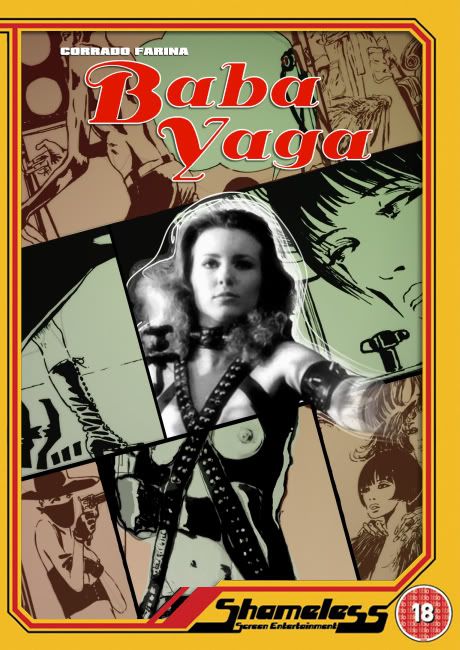 Option 2 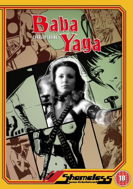 Option 3 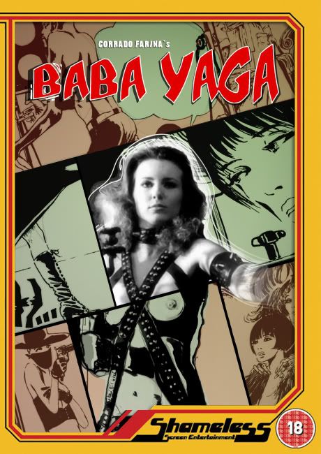 Option 4 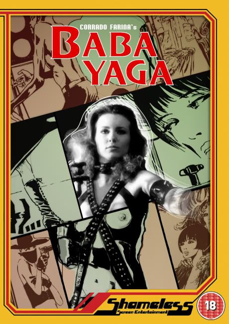 |
|
#46
3rd September 2008, 09:41 AM
| ||||
| ||||
|
and finally option 5 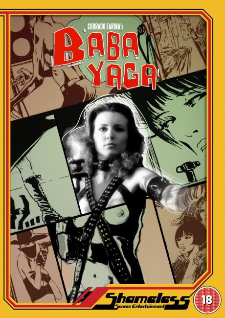 (can't fit 5 images into a single post I'm finding out!) |
|
#47
3rd September 2008, 10:12 AM
| ||||
| ||||
|
I'm torn between 1 and 5... The main image looks just fine as it is though. Good work there Mr Zarith 
__________________ lovelockandload - Euro Cult Movie Info, Tee Shirts and more! |
|
#48
3rd September 2008, 10:12 AM
| ||||
| ||||
|
hmmm, 1 or 3 I think. I love the comic book style font on 3 but I think font 1 suits the cover better, and it's classier. It's a tough one though, they all look good. Nice work on improving the cover btw Zarith Looks great.
|
|
#49
3rd September 2008, 12:19 PM
| ||||
| ||||
|
All 5 are brilliant but I'm finding myself drawn to 3 and 4... Not sure which I prefer. I think maybe 3... 
__________________ |
|
#50
3rd September 2008, 12:25 PM
| ||||
| ||||
|
1 or 4 for me. I think the font on the first one fits in perfectly with the main image. So I would say that No1 just shades it for me |
 |
| Like this? Share it using the links below! |
| |


 7Likes


 Linear Mode


