
|
|
#61
 4th September 2008, 10:52 AM
| ||||
| ||||
|
Yeah on the new site (due late October) we'll be highlighting threads on the front page to keep everyone up to speed because I think it's quite easy to miss what's going on.
 |
|
#62
4th September 2008, 12:54 PM
| ||||
| ||||
|
I prefer 1 and 4. I'm not sure about 3... it might be pushing the cartoon concept too far. But it's up to you, ladies and gentlemen, to decide  |
|
#63
4th September 2008, 06:54 PM
| ||||
| ||||
|
Don't sit on the fence mate-kick it down....  I think you're spot on Zarith with the cartoon element of 3. i.e SHAMELESS-sleaze and gore or Anime? |
|
#64
4th September 2008, 10:20 PM
| ||||
| ||||
|
After looking at them again I definatley think font 1. I do like 3 but I think Reaps has got a point, very cartoon/ anime-esque. Font 1 all the way for me Last edited by Halloween_22; 5th September 2008 at 08:09 AM. |
|
#65
5th September 2008, 11:42 AM
| ||||
| ||||
|
I agree with Halloween! It was a tough call - but Number 1 is best. 
__________________  |
|
#66
5th September 2008, 02:46 PM
| |||
| |||
|
I like option 4. The Y in option 1 is slightly V like imo. Zarith, who's the Avatar off.?. Last edited by vipco; 5th September 2008 at 03:06 PM. |
|
#67
10th September 2008, 11:33 AM
| ||||
| ||||
|
Option one looks the best, Almar. Kev W |
|
#68
11th September 2008, 03:42 PM
| |||
| |||
| |
|
#69
11th September 2008, 07:35 PM
| ||||
| ||||
|
I'll keep their Diazepams in abundant supply Vince..... |
|
#70
11th September 2008, 11:40 PM
| ||||
| ||||
|
Alrighty after going through all the feedback here and from our good friends at lovelockandload.com http://www.lovelockandload.com/forum/ (rather spiffy Shameless competition over there I recommend you all enter...) here's the latest from Zarith - some new cool colours plus the finishing touches. 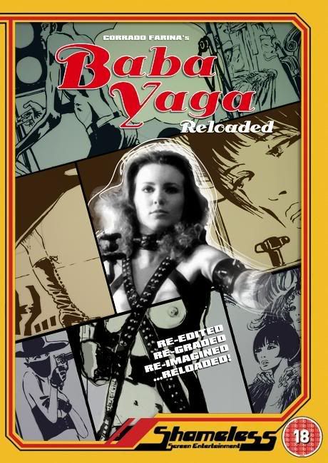 |
 |
| Like this? Share it using the links below! |
| |


 7Likes


 Linear Mode


