
|
|
#71
 14th September 2008, 06:58 AM
| ||||
| ||||
| Quote:
  |
|
#72
14th September 2008, 11:53 AM
| |||
| |||
|
A few of Optimum's recent titles have received cuts. Some of the westerns (Soldier Blue, Navajo Joe etc) have had the usual horsefall trims (although Soldier Blue finally restores all the previously cut violence) and the Black Emanuelle films have been cut to avoid R18 ratings. The main 3 targets for the BBFC these days are consensual rape scenes, strong sexualised violence (inc torture etc) and animal cruelty. Caligula didn't have any of these (it's about all it didn't have though)  though the passing of the hardcore scenes in an 18 is still pretty astonishing stuff. though the passing of the hardcore scenes in an 18 is still pretty astonishing stuff.
|
|
#73
16th September 2008, 07:18 PM
| ||||
| ||||
| Quote:
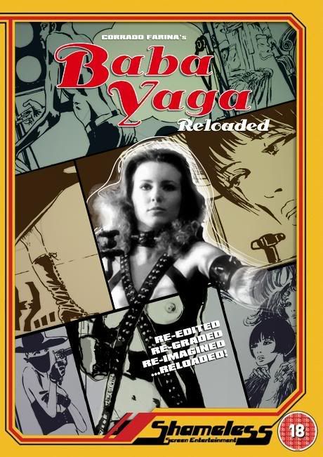
Anyone got any thoughts on this latest draft then? If anyone is holding back then hey let's hear it - if not this'll be the sleeve! |
|
#74
16th September 2008, 07:22 PM
| ||||
| ||||
|
Perfect-explains shameless down to a tee....fun,sleazy,outrageous and most definetly eye-catching!  |
|
#75
16th September 2008, 07:30 PM
| ||||
| ||||
|
I think it's a fantastic design. I wonder though if it is eye-catching enough though? People have remarked in the past about how the artwork on previous releases jumps out at them, I'm not so sure that this does that, and that's only because of the muted colour scheme that's been used. Again, it's a top sleeve, just adding my 2 pence worth. |
|
#76
16th September 2008, 07:36 PM
| ||||
| ||||
|
Yip - that'll do for me!  |
|
#77
16th September 2008, 07:40 PM
| ||||
| ||||
| Quote:
|
|
#78
16th September 2008, 07:43 PM
| ||||
| ||||
|
Cool - I do want debate here and yes this is quite a muted design compared to previous efforts - would it look better in brighter colours? Would it work in that design? I don't want us to be slaves to bright colours and with yellow boxes and borders I think we can risk different styles but that's interesting input.
|
|
#79
16th September 2008, 07:46 PM
| ||||
| ||||
|
Not too much tweaking imho Almar,but yes it does need a touch brighter colours imho again.... It just won't 'loup' out at you from a display with hundreds of dvds surrounding it.... |
|
#80
16th September 2008, 09:08 PM
| ||||
| ||||
|
Is this better?  |
 |
| Like this? Share it using the links below! |
| |


 7Likes


 Linear Mode


